Packaging Design Color Psychology: How Colors Influence Buying Decisions
Packaging design color psychology is one of those topics everyone thinks they understand — until they get their first printed sample back and realize the color looks nothing like what was on screen. Worse, a color that "felt right" on a mood board can feel completely wrong once it's sitting next to competitors on a shelf or landing in a customer's mailbox.
Colors on packaging do influence buying decisions1, but not in the simple "red = excitement" way most articles suggest2. The real impact depends on three things most brands overlook: your product category, your target market's cultural context3, and your actual packaging material. Getting any one of these wrong can mean costly reprints and missed launch windows.

I've spent years advising DTC brands, e-commerce sellers, and distributors on color choices for custom boxes and bags. Let me walk you through what actually matters when you're picking colors for your next packaging order — and how to avoid the mistakes I see most often.
Why doesn't the "red means excitement" rule actually work?
You've probably seen those color psychology charts floating around. Red equals energy. Blue equals trust. Green equals nature. They're not completely wrong, but they're dangerously incomplete. Applying them without context is like choosing a font just because someone said "serif looks professional."
No color is universally good or bad. The same shade of green that signals organic credibility on a US health-food box can look cheap and dated on a luxury cosmetics pouch. Color effectiveness is always relative to your product category and the context where customers encounter your packaging.

Category norms shape color expectations
Here's what I mean by context. When a natural skincare brand comes to us wanting an earthy green box, that usually works. But when a premium fragrance brand picks the same green, we'll flag it. In the fragrance category, customers expect darker tones, metallics, or minimalist monochromes. The green doesn't say "natural" anymore — it says "doesn't belong here."
I've adjusted client palettes more times than I can count when the original scheme clashed with what shoppers expect in that category. Some common patterns I've observed:
| Product Category | Colors That Typically Work | Colors That Often Misfire |
|---|---|---|
| Organic food / health | Earthy greens, warm browns, matte whites | Bright neons, heavy metallics |
| Luxury cosmetics | Black, deep jewel tones, gold accents | Bright pastels, uncoated kraft |
| Children's products | Bright primaries, playful pastels | Dark monochromes, muted tones |
| Tech accessories | Cool grays, whites, single accent colors | Warm earth tones, busy multi-color |
These aren't rules carved in stone. They're category conventions. You can break them — but you should break them on purpose, not by accident.
Differentiation vs. decoration
Here's a trap I see often: a smaller brand copies the color palette of a major competitor, thinking it will give them the same premium feel. But that palette was designed for that brand's positioning. Copying it just makes you blend in.
The smarter move is to pick a direction that stands out in your specific shelf or unboxing context. If every competitor in your category uses black and gold, a well-executed matte white with a single bold accent can grab attention precisely because it breaks the pattern.
Does your packaging material change how colors actually look?
This is the gap I see in almost every color psychology article out there — and it's the one that causes the most real-world headaches. Your color doesn't exist in a vacuum. It exists on a physical material, and that material changes everything.
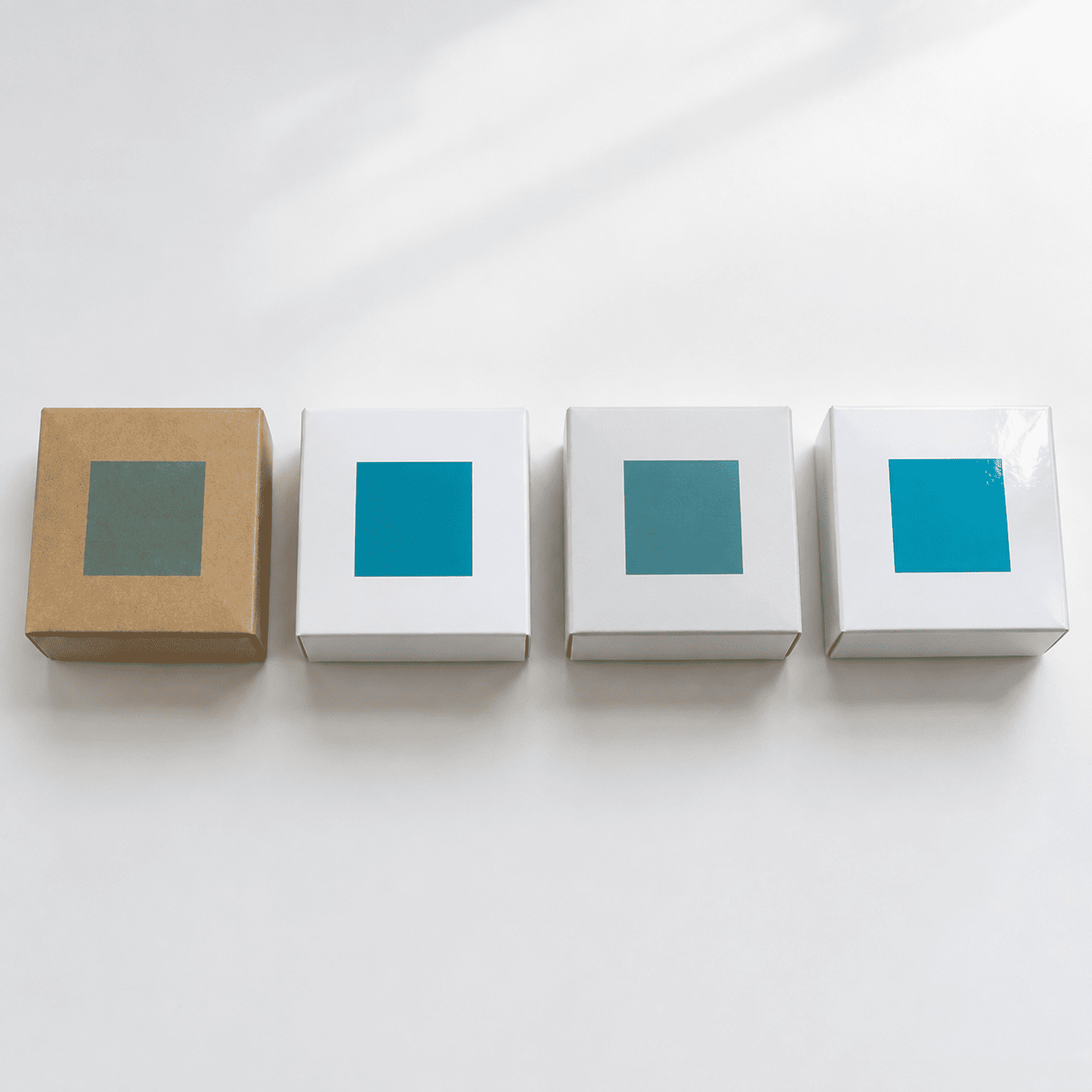
Screen colors and printed colors are fundamentally different4. A vibrant teal on your monitor can turn muddy on uncoated kraft paper, or shift cooler on a matte laminate. Substrate, finish, and ink coverage all alter perceived color — so your material choice is actually a color decision too.

How substrates affect color
When we produce samples, we often see clients surprised by the difference between their digital design file and the physical result. Here's why:
- Kraft paper has a brown base tone that warms and mutes every color printed on it. Light colors can nearly disappear.
- Coated art paper (C1S/C2S) gives the most accurate color reproduction — closest to what you see on screen.
- Matte laminate softens and slightly darkens colors, reducing vibrancy.
- Gloss laminate boosts saturation and adds depth, but can create glare under certain lighting.
A client once sent us a design with a pale lavender background meant for kraft mailer boxes. On screen, it looked beautiful. On kraft, it was barely visible — just a slightly off-brown. We caught it during the sample stage, but if we hadn't, that would have been a full production run wasted.
Practical steps to avoid color surprises
- Always request a physical sample before committing to a full order. Digital proofs help, but they can't replicate material interaction.
- Specify your material first, then finalize colors. Not the other way around.
- Use Pantone references rather than relying on RGB or CMYK screen values. Pantone bridges the gap between what you see and what gets printed.
- Discuss ink coverage with your supplier. Large solid-color areas are harder to keep consistent across a production run than small accent elements.
Can the wrong color hurt your brand in a different country?
If you sell in multiple markets from a single SKU set — which many of our DTC and e-commerce clients do — color choices get more complicated fast.
Colors carry different cultural associations in different markets. A color that feels clean and modern in one country can carry negative or unintended connotations in another. Cross-border brands need to check their palette against every key market before committing to production.
Real examples from our export experience
I've redirected clients away from problematic color choices several times. A few patterns worth knowing:
- White packaging reads as minimalist and premium in US and Northern European markets. But for products also sold into certain Asian markets, heavy use of white can carry funeral or mourning associations5.
- Red is celebratory and lucky in Chinese markets but can signal danger or clearance pricing in some Western retail contexts6.
- Purple often signals luxury in US and European markets but doesn't carry the same weight universally.
The point isn't to memorize a cultural color chart. It's to ask the question before you finalize: Does this palette work in every market I'm shipping to?
If you're selling primarily to US, Canada, Australia, and Western Europe, you're working within broadly similar color conventions. But the moment you add Asian or Middle Eastern markets, get a second opinion.
Frequently Asked Questions
What's the single most important thing to get right with packaging colors?
Match your color to your category expectations and target customer, not to a generic psychology chart. A color that works beautifully in one category can hurt you in another. Start with what your specific customer expects to see, then differentiate within that framework.
How do I make sure my printed color matches my design file?
Request a physical sample on the exact material you plan to use. Provide Pantone references instead of relying on screen colors. Discuss ink coverage and finish options with your supplier before finalizing.
Should I use the same packaging color scheme for all markets?
Not automatically. Check your palette against the cultural context of each major market you sell into. For US, Canada, Australia, and Western Europe, conventions are similar. For other regions, verify before committing to a single global SKU.
Does matte or gloss finish affect color perception?
Yes, significantly. Gloss finish boosts color saturation and vibrancy. Matte finish softens and slightly darkens colors. Choose your finish as part of your color strategy, not as an afterthought.
Conclusion
Packaging design color psychology is real — but it's far more nuanced than simple color-emotion pairings. The colors you choose need to fit your product category, resonate in your target markets, and actually look right on your chosen packaging material. Skip any one of these steps and you risk reprints, delays, and packaging that quietly undermines your brand instead of strengthening it.
If you're planning a custom packaging order and want to get your colors right the first time, I'd love to help. We offer rapid sampling on multiple substrates so you can see and feel your color choices before committing to production. Reach out to our team and let's make sure your packaging looks exactly the way your brand deserves.
"The influence of packaging color on consumer purchase intent", https://d.lib.msu.edu/etd/38546?q=H%20Point. Research in marketing and consumer psychology has demonstrated that packaging color influences product evaluation, purchase intention, and brand perception, with effects moderated by product type and consumer expectations (see, e.g., Labrecque & Milne, 2012, 'Exciting red and competent blue,' Journal of the Academy of Marketing Science). Evidence role: general_support; source type: paper. Supports: That packaging color significantly affects consumer purchase intentions and product evaluations. Scope note: Most studies examine color in controlled experimental settings rather than real retail shelf conditions. ↩
"Color and psychological functioning: a review of theoretical ...", https://pmc.ncbi.nlm.nih.gov/articles/PMC4383146/. Elliot and Maier (2014) in their review 'Color Psychology: Effects of Perceiving Color on Psychological Functioning' (Annual Review of Psychology) emphasize that color effects are highly context-dependent and that simplistic universal color-emotion pairings lack empirical support. Evidence role: expert_consensus; source type: paper. Supports: That color-emotion associations are context-dependent and moderated by individual, cultural, and situational factors, making universal color-emotion mappings unreliable. ↩
"Color, Culture, and the Implications for Emotional, ...", https://repository.lsu.edu/cgi/viewcontent.cgi?article=6757&context=gradschool_theses. Madden, Hewett, and Roth (2000) found significant cross-cultural variation in color associations and preferences across eight countries, confirming that color meanings in marketing contexts are culturally contingent rather than universal. Evidence role: general_support; source type: paper. Supports: That color meanings and associations vary significantly across cultures, affecting marketing and packaging effectiveness. Scope note: The study examined color associations broadly rather than packaging-specific contexts. ↩
"RGB versus CMYK Color Profiles | Difference & Meaning", https://mixam.com/support/cmykvsrgb. The RGB color model used by digital displays is additive and encompasses a wider gamut than the subtractive CMYK model used in printing; colors that fall outside the CMYK gamut cannot be accurately reproduced in print, resulting in perceptible shifts in hue, saturation, or brightness (see 'Color model,' Wikipedia). Evidence role: mechanism; source type: encyclopedia. Supports: That RGB (additive, screen-based) and CMYK (subtractive, print-based) color models produce different gamuts, causing visible color shifts between screen and print. ↩
"Color in Chinese culture", https://en.wikipedia.org/wiki/Color_in_Chinese_culture. In Chinese, Korean, and several other East Asian cultural traditions, white has historically been the color of mourning and is worn at funerals, in contrast to Western conventions where black serves this role (see 'Color in Chinese culture,' Wikipedia). Evidence role: historical_context; source type: encyclopedia. Supports: That white is traditionally associated with death, mourning, and funerals in several East Asian cultures, including China, Korea, and parts of Southeast Asia. Scope note: Modern urban consumers in these markets may hold more globalized color associations, so the traditional connotation may be attenuated for younger demographics. ↩
"The color red attracts attention in an emotional context ... - PMC", https://pmc.ncbi.nlm.nih.gov/articles/PMC4413730/. Puccinelli et al. (2013) and related retail psychology research have found that red price tags and signage activate discount associations among Western consumers, potentially lowering perceived product quality or prestige when used in non-sale contexts. Evidence role: general_support; source type: paper. Supports: That red is associated with price discounts and sale signage in Western retail, and that this association can influence consumer price perceptions. Scope note: The effect is context-dependent and may be weaker for premium-positioned products with strong brand equity. ↩